
The NHL season is now upon us and as mandated by my Canadian passport, I’m obligated to make some sort of hockey-related post. In a former life, I used to work at a store that sold jerseys, with NHL jerseys being our most popular sellers, so this is a subject near and dear to my heart. Of the four major North American sports leagues (we here in Canada still like to think of the NHL as being part of the four major North American sports leagues, and in fact aren’t so sure if the other three measure up), I’d say that hockey lends itself best to providing really ugly jerseys. Most of this has to do with the simple fact that hockey jerseys (or sweaters as traditionalists like to call them, even though they stopped being sweaters sometime around the advent of colour TVs) are the biggest jerseys, and thus provide a bigger canvass for people with no taste to mess with. It doesn’t help that NHL teams aren’t exactly run by the savviest of marketers (when much of the talent and front office personal in a sport come from backwater Saskatchewan and the like, fashion sense isn’t an overly valued commodity).
So while baseball has its basic button up shirt designs, football has its basic colours and big numbers design, and basketball has the smallest canvass to work with, hockey jerseys are neck to thigh, full sleeved chances to throw in far too much colour, piping, or horrible logo choices. The flip side to this is that when a jersey is done right, it can be amongst the best looking jerseys in all of sport. But that’s not the case with these abominations.

#10. Atlanta Thrashers 2008-09 Third Jersey – We’ll start with the inspiration for this list, the brand new third jersey for the Atlanta Thrashers. When they unveiled this bad boy, I had to wonder if it was indeed the ugliest hockey jersey I’ve ever seen. Then I remembered some of the ones ahead of it on the list and decided that it probably isn’t, but it’s close. The big number on the front makes it look like a basketball jersey, while the big shoulder logos look like they’re stolen from the San Diego Chargers jerseys. The only reason why it’s not higher on the list is because I haven’t seen it on the ice yet.

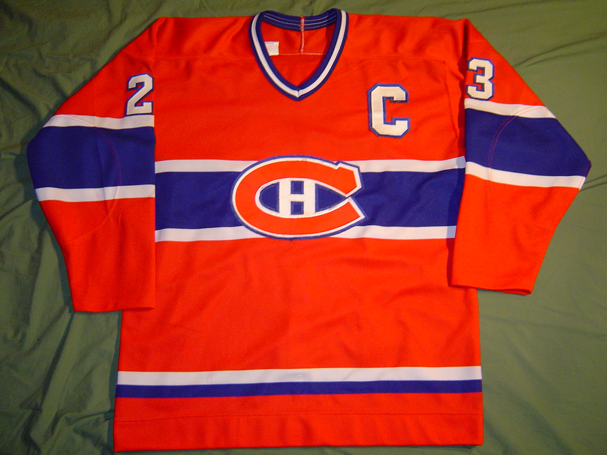
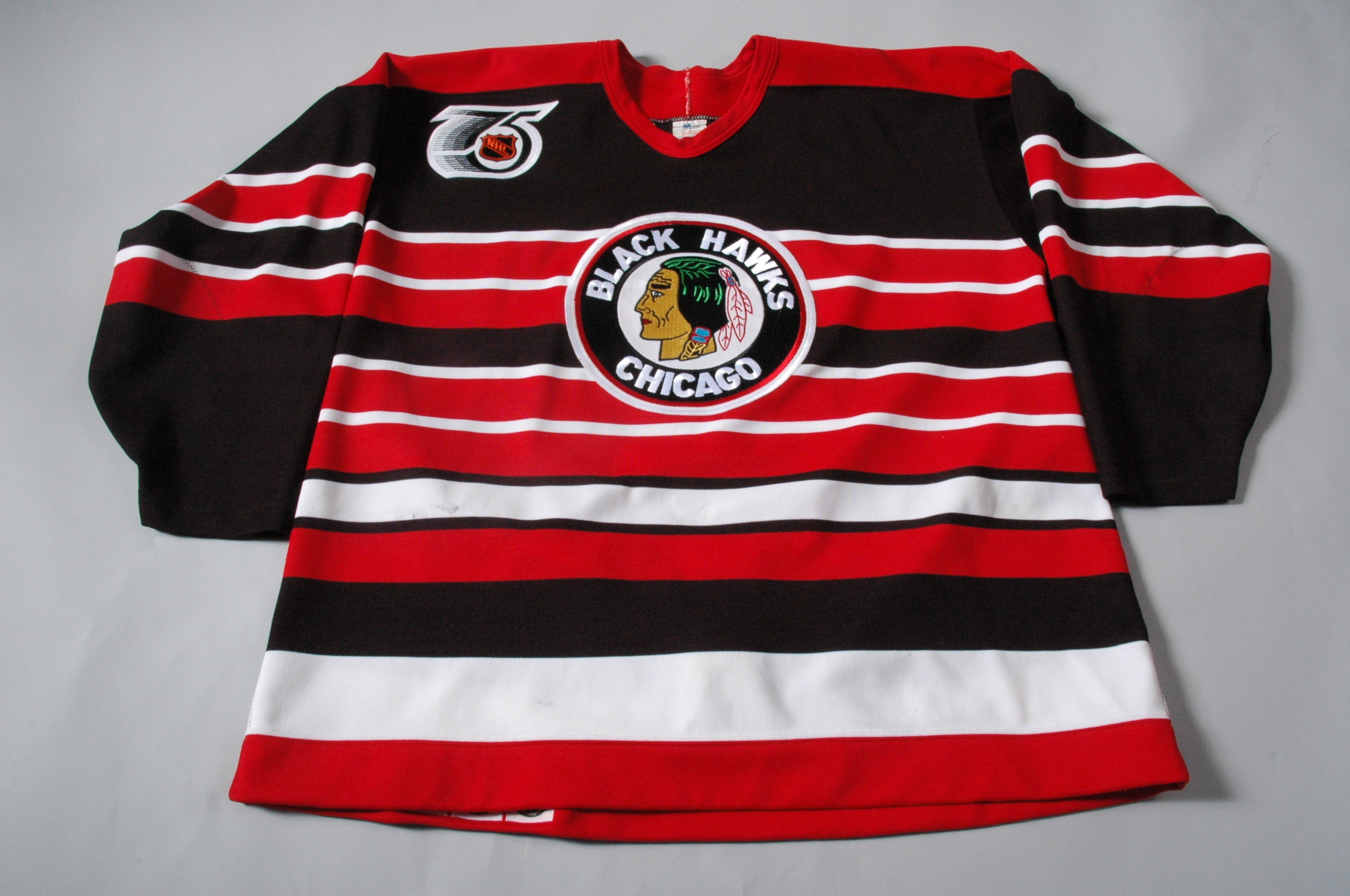
#9. Ottawa Senators 1930-34 Jersey – Both the early Senators and early Chicago Blackhawks had similar barber-shop pole-type horizontal stripes looks so gaudy, fans could be happy that they were still decades away from colour printing, much less television (the Blackhawks brought theirs back as throwbacks in the 1993-94 season). I decided to go with Ottawa over Chicago for this one in part because the “O” logo is really uninspired, but mostly to point out one of pet peeves: the entire idea of the “Original” six. The Original Six is the term given to the six NHL teams that existed in the NHL for 25 seasons prior to the 1967 expansion (the teams are the Montreal Canadiens, Toronto Maple Leafs, Chicago Blackhawks, New York Rangers, Boston Bruins, and Detroit Red Wings). Well, take a look at the date of this jersey. 1930. Which my calendar says comes before 1967, and 1942. My dictionary also says that the word “original” means “belonging or pertaining to the origin or beginning of something, or to a thing at its beginning”. But if the Ottawa Senators existed in 1930, and aren’t one of the “Original Six”, then what the heck is going on? What’s going on is that hockey people seem to not have a very good grasp of what “original” means, and the whole concept of the “Original Six” is fake. /rant
PS- Who were the actual original teams of the NHL? The Montreal Canadiens, Montreal Wanderers, Ottawa Senators, and a Toronto team that didn’t quite have a name, but is mostly known as the Arenas, who were an early precursor to the Maple Leafs. So of the “Original” Six, only two of them have a claim at being original members of the NHL.

#8. The Mighty Ducks of Anaheim 1997-99 Alternate Road Jersey – When you name your team after a lame Disney movie franchise, you’re already not setting yourself up for attractive merchandise. The team has never had a good looking jersey, not even now that they’ve disassociated themselves with Disney and dropped the “Mighty” from their name. But when it came time to create a new third jersey (after their initial foray into the third jersey business to be discussed later), they really outdid themselves in the ugly department, creating not one, but two third jerseys (so technically one was a “fourth” jersey, which is why it’s probably better just to refer to them as alternate home or road jerseys). Of the two, the road jersey was easily the ugliest, with shiny satin shoulders and arms of grape purple and silver set off with yellow piping on top of a jade jersey. Silver, purple AND teal, way to go Disney! (By comparison, the white home alternate isn’t so bad). To be fair, Mighty Ducks merchandise did consistently sell well to kids, so maybe they knew what they were doing, but I suspect kids would have also bought non-ugly jerseys just as quickly. On the flip side, we often didn’t even bother stocking Mighty Ducks jerseys in adult sizes, and didn’t get many requests to either.

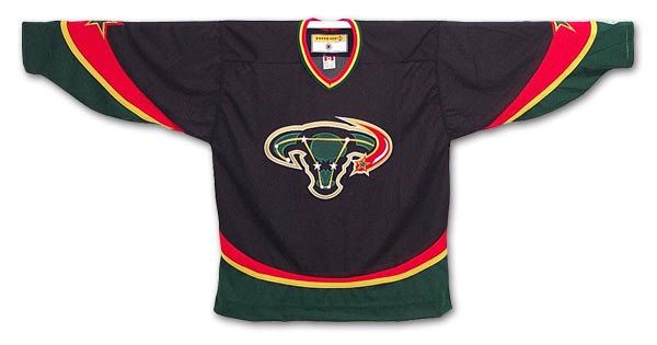
#7. Calgary Flames 1998-2006 Third/Road Jersey – Not that the jerseys these eventually replaced were much better, but what the hell was Calgary thinking with the Flaming Horse Head? This jersey is an excellent example of all the problems I discussed in the introductory paragraph, chosen by the good old boys that make up the Flames organization who were easily sold a bill of goods by some opportunistic marketing company. Everything about it suggests lame adherence to market research. The kids like black jerseys? Then let’s get one. The kids like animal mascots? Let’s get one of those too, even if it has literally NOTHING to do with our team name. While you’re at it, can you make sure the animal logo and colour scheme completely undoes any of the cool points we could score by having a black jersey? Maybe even make the logo asymmetrical. Excellent. Throw in an ugly number font and we have a deal.
As I mentioned earlier, I worked at a jersey store while these abominations were around. Well, that store was in Calgary, and even there, these weren’t big sellers. Granted, this was before the Flames Stanley Cup Finals run of 2004, when everyone in town broke their shoulders trying to jump on the bandwagon they now pretend they were always a part of. Luckily for them, by then the Flames added new home and road jerseys that pushed the horse to the shoulders, allowing them to buy merchandise that represented their weeks-long love affair with the team that wasn’t quite so ugly.


#6. Vancouver Canucks 1985-89 Home and Road Jerseys – The putrid yellow in place of the traditional home white, set off by orange and black is ugly enough to speak for itself. What makes this jersey worse is the logo, a stylized hockey skate… that points downwards. I realize that coming up with a logo for a team name that is slang for the country it represents isn’t easy (although, not impossible), but a downward pointing skate? That’s not a logo, it’s a metaphor for the team and its long history of futility. What’s sad is that as bad as these jerseys were, they still were a massive improvement over what came before them (more on that later).


#5. California Golden Seals 1974-76 Home and Road Jerseys – Hockey jerseys? Or Roller Derby warm-ups? What’s odd is that these abominations came AFTER flamboyant owner Charlie O. Finley gave up the team (but before he had installed these list-worthy creations as uniforms to match his all-time ugly Oakland A’s jerseys). The NHL took over the Golden Seals in February of 1974, which I guess means the league is responsible for unleashing these things. Another odd thing? When Finley applied to buy the team, he had to outbid Jerry Seltzer… the second and final owner of the original Roller Derby league.

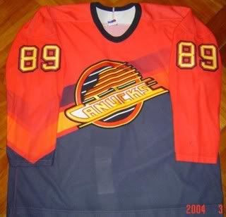
#4. Tampa Bay Lightning 1996-99 Third Jersey – Attention NHL: just because you have room for several different designs and colours, doesn’t mean you should use it. This thing looks like a 12-year-old’s doodle pad, complete with a goofy jagged number font. This jersey is probably the biggest example of a late 90s trend that I hope never returns: silk-screened designs. In order to get all that business going on the jersey, it had to made out of cheaper material and silk screened the images unto the fabric. Here’s a tip: if you can’t make your design work with different fabrics, embroidery, or piping, then its not a design worth having.


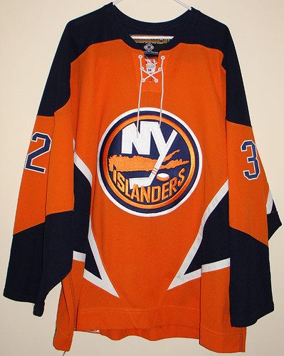
#3. New York Islanders 1995-97 Home and Road Jerseys – Ahoy ye mateys, here be the dreaded Captain Highliner jersey, a scurvy dog of a uniform that brought down a once proud franchise with its ridiculous wavy lines (brought to you through silk-screening), and possibly the worst logo in the history of hockey (perhaps a list for another day). Here’s an interesting read about the Isles fisherman logo from a guy who was a PR director for the team at the time. It sounds like everyone knew it sucked then too.


#2. Vancouver Canucks 1978-85 Home and Road Jerseys – How could a sixth ugliest jersey of all-time rank as an improvement? When those jerseys replaced these abominations, the ugliest regular jerseys in NHL history, the Flying Vees. V is for Vancouver, V is for Victory, V is for Valour, and with these logoless Halloween outfits, V is for Vhat the fuck were they thinking?!? Basically, the Vancouver Canucks are like the San Diego Padres, in that for most of their existence, their outfits were butt ugly.

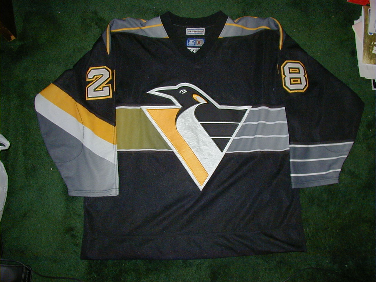
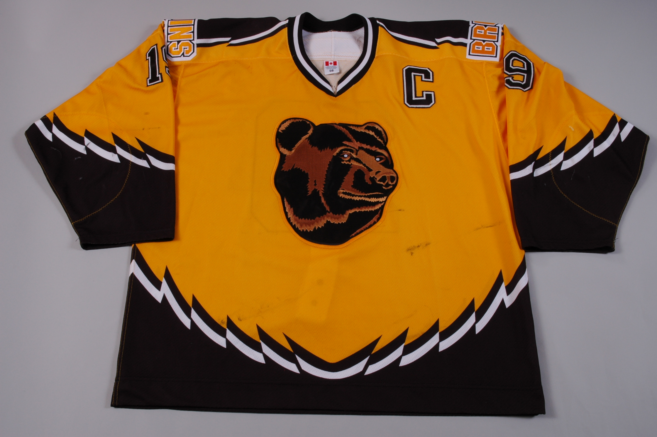
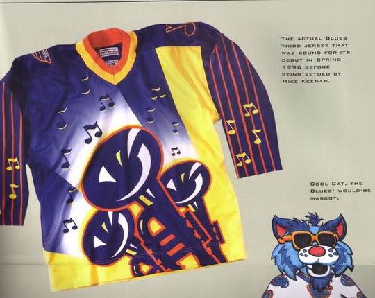
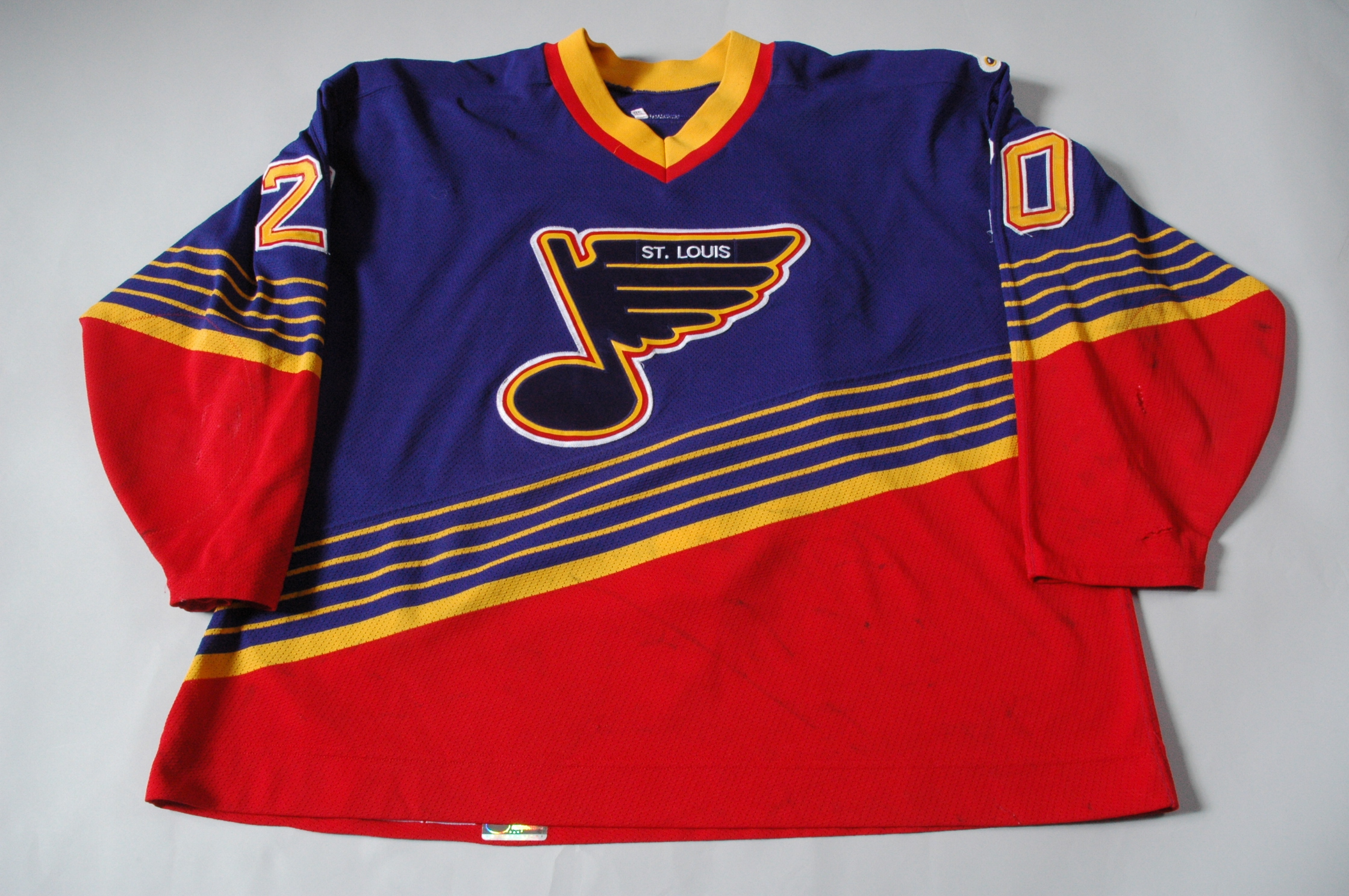
#1. 1996 Third Jerseys (Mighty Ducks of Anaheim, Boston Bruins, Los Angeles Kings, Pittsburgh Penguins, Vancouver Canucks) – On January 27, 1996, five teams introduced special jerseys to be worn either on Saturdays or on special occasions, thus introducing the concept of the third jersey to the NHL. And they were horrific. Okay, Pittsburgh’s robo-penguin jerseys weren’t bad (other than the colour-gradient-necessitated silk screening), and were an improvement over their rather dull road jerseys of the time, so they get a pass (other than guilt by association). But the rest are dreadful, forcing me into this four-way tie cop-out for first place; otherwise, these jerseys would have dominated the list. And, hey look, it’s our old friend Vancouver again, with a jersey that probably worked great for road crew safety, but not so much for a major league sports franchise (tough call to say which is uglier, this or the flying V). The Boston Bruins stuck with their sad pooh bear jerseys for far too long (the jerseys survived until 2006, making them the longest tenured third jersey in NHL history), despite the fact that it was the least fearsome bear logo in the history of sports. But the worst of the worst came out of California, with the Los Angeles “Burger” Kings and those god-damned Mighty Ducks again. There’s really nothing more that needs to be said to explain why these are the absolute worst jerseys in the history of the NHL, perhaps of any sport ever. And to think, it could have been worse. There was one more team that was supposed to debut a third jersey that night, the St. Louis Blues. But, in possibly the last good decision he ever made, then-coach Mike Keenan refused to allow his team to hit the ice in the jerseys that easily would have been the worst of all-time, for all-time.
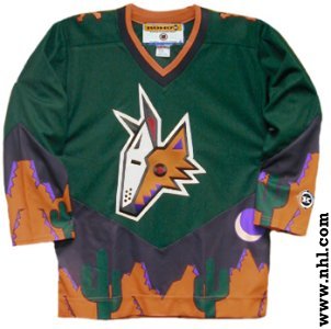
Dishonourable Mentions: Dallas Stars 2003-06 Third Jerseys, Phoenix Coyotes 1998-2003 Third Jerseys, Nashville Predators 2001-07 Third Jerseys, St. Louis Blues 1995-98 Road Jerseys, New York Islanders 2002-06 Third Jerseys
A special thanks goes to NHLUniforms.com for their excellent research that helped me put this list together. Go there to see images of every jersey ever worn in NHL history.

Interesting list. The horsehead jersey grew on me, but the current one is better. To me a horsehead logo makes only slightly less sense than a stylized letter-C. Throw in Calgary’s wannabe cowboy heritage it makes even more sense.
What I really don’t like still is the continued adherence to white jerseys. A widescreen HD tv makes this even worse, since you have to look at a huge expanse of white. Seeing a playoff game on T.V. at the Saddledome is just amazing with the crowd and players in the red jerseys. I don’t see why they can’t just use inverse colours or, better yet, just have the one jersey. It’s not like any of the NHL teams have the same team colours.
That wouldn’t work at all. Just using the colour red, you have the:
-Calgary Flames
-Carolina Hurricanes
-Chicago Blackhawks
-Detroit Red Wings
-Minnesota Wild
-Montreal Canadiens
-New Jersey Devils
-Ottawa Senators
-Washington Capitals
All are basically the same shade of red, the list increases when you add teams with burgandy colours like Atlanta, Colorado, and Phoenix. In a game as fast as hockey, often you have split-seconds to use your peripheral vision to decide if the guy a few feet away from you is a streaking teammate looking for a pass, or a hulking defenseman looking to crush you. This is why white jerseys are essential. Even from a fan’s perspecttive, imagine trying to differentiate players from two different teams wearing the same colours if you were sitting in the nosebleeds (or press box for that matter), or watching on a smaller TV in a bar.
The NHL changed a few years ago so that home teams wear their colours, while road teams wear white. This allowed fans to see their team colours in person. The downside is that fans now see the same colours every game (their team wears their colours, the other team always wears white), whereas in the past, they got different colours coming to town.
Pingback: Top 10 Ugliest Uniforms in Baseball History « Critically Speaking
Yes, hockey jersey have the biggest canvas of the pro sports, but it also allows for some of the best jerseys (and, i agree, some of the worst). Some hockey jerseys can be cluttered, too cartoony, and/or laid out badly with too many colours that some times clash. Some are boring, but not as many of the boring ones you see in the MLB, NBA, and NFL.
I agree with most of your choices. I don’t agree with the yellow Vancouver ‘V’ choice though (I know I’m in the minority – I also like the Astros rainbow jersey). I think they fall in the category so tacky and bold they are cool.
The NHL allowing a team to be called ‘Mighty Ducks’ is a travesty. They should have had the guts to tell Disney ‘Try again with the name and design. This a major professional sports team.’
Off the top of my head, one I think you could have added to the top 10 is the original Capitals jerseys. The logo looks like it was done by a five year old with an etch-a-sketch.
Great article overall. Loved the added links in your article – especially the one on the Fisherman logo.
@Will
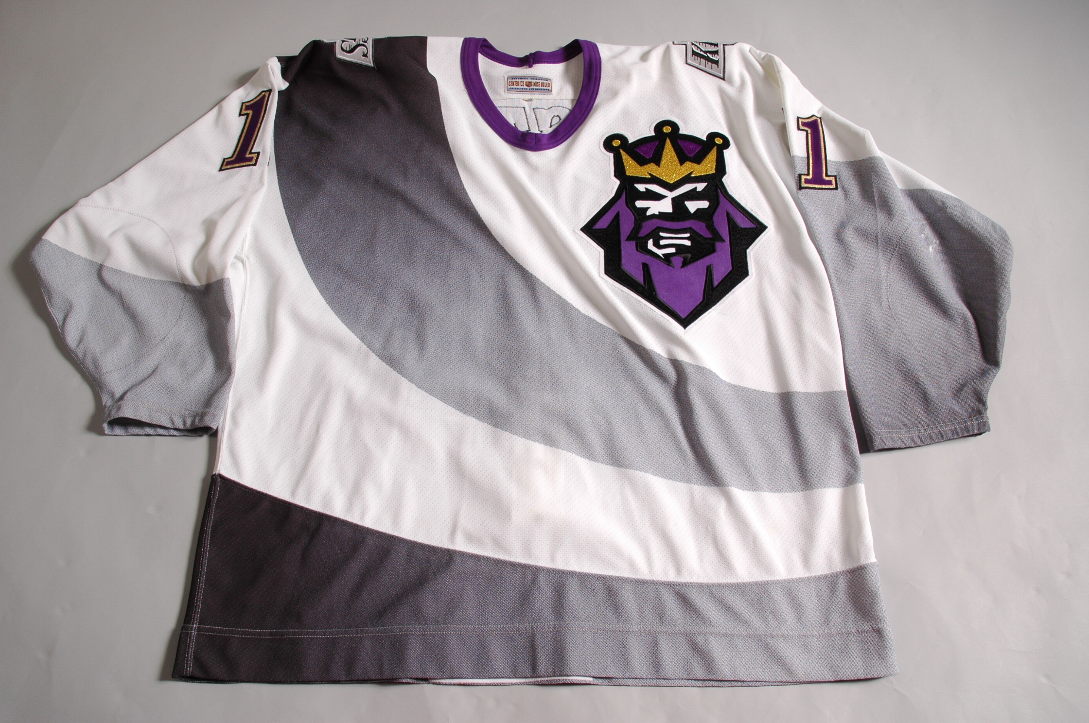
Everyone has their favourite so-ugly-I-love-it jersey. For me, it’s the purple and gold Crown Royal L.A. Kings jerseys. And, yes, while I didn’t emphasize this enough, the bigger canvass can lead to some of the best jerseys in sports as well. I suppose that’s a list that I should consider as well, but then my bias will come through even more.
As for the orignal Mighty Ducks logo, I had always liked it, but HATED the color scheme (purple and teal…are they serious? Is this hockey or a kids show about a purple dinosaur?). The new ducks colors are good, but the logo of the webbed duck foot for a ‘D’ is just plain lazy. The new Rbk jerseys that the NHL put out last year are all pretty much atrocious. They did manage to improve a few jerseys (Washington SHOULD be red, white and blue; and Columbus saw a much needed upgrade), but for the most part, they trashed some good things for a cash push. Can anyone tell me how putting pretty much every single type of jersey modification (stripes, vertical lines, outlining shoulder stripes – not talking about the 5 lines for the cups – and collar ties) make the Islanders jerseys better? For crying out loud! NYI fans probably just started sleeping through the night again after nightmares about the Gordan Fisherman! And don’t get me started on jerseys put out by Dallas (numbers on front), Atlanta (numbers on front and MAROON? WTF?), Ottawa and Tampa (Sens and Bolts on front, nicknames…come on…what’s next: Habs vs. Wings?). All of these teams had much better jerseys before.
@Evan
Like you wrote, I never had a problem with the Mighty Ducks logo, but the colours were terrible, made worse by the extra design features of the alternates of shiny fabrics.
Yeah, the RBK Edge jerseys are terrible, so terrible en masse that there was no point in going over them all here. But why they felt the need to add scoop hems and all the underarm piping, I don’t know. But I guess it could be worse, given that there was talk about tucking the jerseys into hockey pants.
WOWW Great post!! I just add this to my bookmarks. Thank You ^_^
Pingback: Top 10 Ugliest Jerseys in NBA History « Critically Speaking
Good start to a potentially long list…..with all the leagues out there, plus all the novelty promotional jersey nights they have, there are literally hundreds of different bad jerseys out there…….that being said, it is very ironic that the uglier the jersey, the more in demand and harder to find amongst game worn collectors. Go figure.
More evidence that game worn collectors are a strange breed (although, thanks to some of them, I had pictures for this blog).
even as a blues fan, I can’t defend the clown-red-stripe abortion. just terrible uniforms.
On the bright side, you guys now have some of the best jerseys in the NHL, so they learned their lesson.
this list totally blows. all of these jerseys are fuckin awesome. and how can you have multiple jerseys in the #1 spot? useless list IMO
I can only weep at how terrible your wardrobe must be if you think these monstrosities are fucking awesome.
The good news is that you may be qualified to design jerseys for minor league hockey. Huzzah old bean!
Why the hell is the Penguin’s jersey tied for first?! It’s f***ing nice. MORON!
“Okay, Pittsburgh’s robo-penguin jerseys weren’t bad (other than the colour-gradient-necessitated silk screening), and were an improvement over their rather dull road jerseys of the time, so they get a pass (other than guilt by association)”
It helps when you actually READ the explanation when looking for an explanation.
PS- This is the fucking internet. If you want to swear, then just fucking swear already.
I TOTALLY disagree.
I love the old canucks jersey with the skate pointing downwards. I’ve never seen anyone skate while their skate was point upwards! and the 96′ verison is even better!
The thrashers third jersey looks very nice, and a LOT better than their home/away jerseys…
Ottawa 67′ jerseys are a classic, can’t beat em’.
Ducks and Flames jerseys are pretty cool too.
i wish the kings came back with the “Great One” era jerseys with the black n silver.
I think the Flyers have a great color scheme going on, but lack a decent logo.
You guys are all just jealous that the Canucks franchise is probably the most prominent team in Canadian hocke. They sell out every game and they make the playoffs most of the time they need clutch payers is all. So that doesn’t mean that tabloid writers like yourself should go and put teams’ jersery’s as ugly. I don’t know if you have gotten the team’s permission to do so but think about this the person who designed the jerseys alive or dead would hate to see his work deemed as one of the ugliest jersey’z in the nhl.
I will always be jealous of Vancouver’s long and storied tradition as one of the most successful franchises in NHL, nay, SPORTS history. Every time I watch a Canucks game and the camera pans over all the banners hanging from GM place, I turn green with envy.
And yes, my heart goes out to the poor designer (or said designer’s widow and surviving family members) whose self-worth is so fragile that it can be destroyed by something written on some dude’s blog.
If this is sarcasm,you sound like a major douche.
bud i can tell you were never that great at hockey?the majority of those jerseys are nice? with the exception of the blues jersey on hounarbel mentions,seals and the badly named mighty ducks. i bet your probably a soccer fan
I’m not sure how the ability to play hockey has anything to do with the ability to judge the aesthetics of an article of clothing, but you got me! Clearly, only a soccer fan would object to a series of garish colours and ill-advised design concepts. Because if there’s one thing that can be said about soccer, it’s that its jerseys are always tasteful.
This is the worst article ever!!!!!!!!!!!!!!!!!!!!!!!!!!!!!!!!!!!!!!!!!!!!!!!!!!!!! Some of favortite jerseys are on here! THe islanders, the flames, the canucks red third jersey. You are a loser bud.
The Ottawa Senators folded in the mid 1930s. When a new team was brought to Ottawa in the 1990s, they decided to name that team the Senators also. So the current Senators team is not an ‘Original’ team. And the ‘Original Six’ title has nothing to do with the first season. Learn the history of the sport before you mock it.
I’m well aware of what the Original Six are, and the origins of the NHL, and the early roots of the Ottawa Senators. What I am mocking is the term ORIGINAL, which is generally defined as “preceding all others in time or being as first made or performed”, a term that does not apply to two-thirds of the “ORIGINAL six”. Referring to the Blackhawks/Red Wings/Rangers/Bruins/Canadiens/Maple Leafs configuration as ORIGINAL is like referring to the voyagers of the Mayflower as the ORIGINAL inhabitants of Plymouth Rock.
I suppose I can see your point, but I hope you didn’t pull out the dictionary just to define original… Anyhow I agree with most of this list, but I feel like there are worse uniforms than the black Calgary ones, like the vomit-yellow Predators jerseys or anything the Coyotes wore before 2003. Nice list overall though.
Pingback: Critically Speaking 2010 blogging in review « Critically Speaking
Sorry, I think the blue Colorado Rockies jersey ends all ugly jersey arguements.

Wtf?!?!?!
#6 is like my favorite jersey ever!!!
So I guess that means you left out the all of Lame jerseys of every team in the NHL! Only the old ones were good, and most of the players suck now.
We absolutely love your blog and find a lot of your post’s to be exactly I’m looking
for. Would you offer guest writers to write content to suit your
needs? I wouldn’t mind producing a post or elaborating on a number of the subjects you write with regards to here. Again, awesome web log!
Thanks for a marvelous posting! I definitely enjoyed reading it, you’re a great author.I will be sure to bookmark your blog and may come back sometime soon. I want to encourage yourself to continue your great writing, have a nice weekend!
Attractive section of content. I just stumbled upon your web site and in accession capital to assert that I get in fact enjoyed account
your blog posts. Any way I will be subscribing to your augment and even I achievement you access consistently quickly.
A decade late to the party! Don’t disagree with a whole lot on this list, but the Calgary horsehead jersey isn’t entirely random. Hideous, yes, but I think they were trying to tap into the city’s history of ranching/equestrian, the Calgary Stampede and subsequently playing in an arena nicknamed the saddle dome. They regrettably should’ve changed their name from the Flames to something a little more relevant to Calgary when they relocated from Atlanta. Think that jersey was more or less an unsuccessful nod to regional heritage versus a random animal logo. I much prefer the coat of arms of Alberta on the shoulders than I do the horse heads.