
 For the most part, baseball uniforms are all pretty similar and business-like with the buttons down the front. For most of major league history, all home jerseys were white with the team’s name or logo on the front, and the road jerseys were grey with the name of the team’s city on the front. They brought in colour in the seventies, often replacing the road jersey, or just using the coloured jersey as an alternate jersey. Currently, every team in the league has at least one white home jersey and a grey road jersey. Then, teams have a bunch of other coloured jerseys as alternates, some with home and road alternates (generally, but not always, distinguished by the name on the front – nickname at home, city name on the road). None of the uniforms on this list are currently being worn in the majors.
A couple of notes on the list before I begin. One, I’m only counting jerseys that were worn in games by major league teams (not including gimmick jerseys, like the time the majors had futuristic jerseys). So no batting jerseys, which are often so experimental and gaudy that they’d need their own category. Two, while I list a year for the jersey, it isn’t necessarily the only year that particular jersey was worn, it’s just a year I know for sure it was worn.

10. Florida Marlins 1993 Alternate Home Uniforms– Ahhh… the nineties. Remember when everyone was into teal? What was that all about? Teams like the NBA’s Charlotte Hornets made a killing in sales with teal jerseys. The only hotter cooler than teal was black, the colour of choice for west coast gangstas everywhere. So what do the expansion Marlins do? Teal AND black. Genius! To make it even edgier, why not toss in silver? It’s as though the Hornets and the Oakland Raiders had a baseball-playing love-child. The team is still saddled with the teal, black, and silver colour scheme, but have wisely dropped the all-teal alternate jersey in favour of a black one.

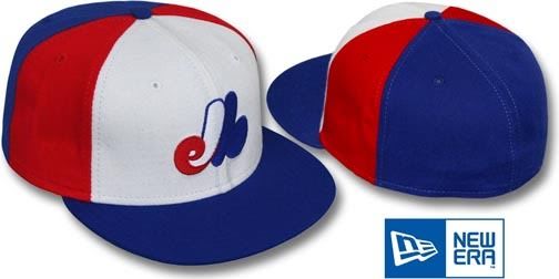
9. Montréal Expos 1982 Road Uniforms- In the late seventies/early eighties it seems like every team thought that replacing grey with pale blue would be just the thing to recapture the fans they were losing to football. And, with the exception of the Kansas City Royals, they were all ugly. I had a bunch of pale blue riders to choose from in the era, including the Toronto Blue Jays, the St. Louis Cardinals, the Milwaukee Brewers, and the Philadelphia Phillies. I went with les Expos because of the piping on the sides and top. It’s the extra dab of colour that really makes these extra ugly. The use of the “mexpos” logo to left side with the number on the right adds to the overall ugliness (the home whites were pretty ugly for the same reason). To top it all off, they wore pinwheel caps with these to complete the look. Well, okay, I kinda dig the pinwheel caps.

8. Arizona Diamondbacks 1998 Home Uniforms- It was a close call between the D-Backs and their expansion brethren, the Tampa Bay Devil Rays, as to whom would get the nod here. The D-Rays were plenty ugly themselves, but ultimately, Arizona went the extra mile to earn their spot. I understand that it’s getting harder and harder for expansion franchises to come up with names and logos that don’t violate another pro or college team’s copywrited nickname and designs, so team’s have to get more and more creative in coming up with team names. As far as new team names go, the Diamondbacks isn’t too bad. What it is, though, is too freaking long to be put on the front of a jersey. Look at it. It’s practically a hockey logo it’s so big. What a terrible design to boot. Plus, they made the unfortunate decision to saddle the team with a southwestern colour scheme. I can see them working there, since its regional and all, but doing so makes certain that their stuff can only be appreciated regionally. Ultimately, what I hate most about this uniform is the purple pinstripes, like they were going to trick us into thinking they’re the New York Yankees. In fact, I hate pinstripes on all uniforms but the Yankees, and maybe the White Sox. That goes for the Cincinnati Reds, Colorado Rockies, and New York Mets. You all need to stop.

7. Oakland Athletics 1972 Alternate Home Uniforms- The Oakland A’s were the first team in baseball history to wear coloured jerseys (well, at least a different colour than grey), when they busted out these double-knit golden yellow babies (or, alternatively, solid green and gold jerseys). They were the brainchild of maverick owner Charles Finley, who encouraged his garishly outfitted club to grow facial hair to fit in with the times. I gotta say “gold” is too nice a description for the colour. “Mustard” is probably closer to the truth. Like many jerseys of the era, this gets bonus points in the ugly competition for being a pullover instead of a button up.

6. Cleveland Indians 1976 Road Uniform- By itself, the jersey isn’t too bad. Garish, sure, but not as bad as the uniforms already mentioned. What set this jersey off to put it at number six is the fact that the Indians wore red pants to go with it. Yep, they were in all red. I don’t know why they didn’t lead the league in ERA that year, as I would think it hard to concentrate on hitting the ball when staring at that much red. It’s like playing against a tomato.

5. Houston Astros 1980 Home Uniforms- These ones are starting to come around lately as retro-cool, in the so ugly-they’re-cool category. I guess that’s true of a few of these, which is why they’re selling for $300 at Mitchell & Ness. I actually don’t have much else to say about these uggos. They pretty much speak for themselves.

4. Chicago White Sox 1976 Home Jerseys- I know what you’re thinking, sure the polo-style collars are gay, but is this jersey really uglier than the Astros one? Well, maybe not on its own, although the collars are pretty gay, but this is an ugliest uniform competition, and in 1976 crazy-ass owner Bill Veeck Jr (who once signed a midget to take one at-bat, and threatened to shoot him if he took the bat off his shoulder) filled this uniform out with shorts. I shit you not. The White Sox wore shorts with this jersey. Presumably, to show off their white socks.

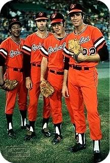
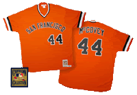
3. Baltimore Orioles 1976 Alternate Uniforms- The San Francisco Giants has a similarly ugly orange jersey around the same time, but the O’s take the ugly orange jersey spot on the list because theirs are a paler shade of orange, making them slightly uglier, and they were complimented by, you guessed it, orange pants. These pumpkin-themed uniforms are perfect for Halloween, but pretty much terrible for the rest of the year. When you think about it, it’s a bit presumptuous for a baseball team to assume they’ll be playing on October 31st anyway (especially in the seventies, before the advent of the Divisional Series).

2. Pittsburgh Pirates 1979 Alternate Home Uniforms- The killer bee jerseys are ugly enough on their own. But, in truth, every uniform the Pirates wore in their “We Are Family” years were ugly. The black road jerseys and the pinstriped home jerseys too. The jerseys themselves were plenty ugly, but what puts them all the way at number two is the bucket caps they wore with them. Look at it. I’m not sure if you can get a true sense of the dimensions in the picture, but its shape is pretty much that of a drum major. It’s the little things that make you stand out in this list.


1. San Diego Padres Uniforms, pick one- Rather than dominate this list with Padres jerseys, I figured I’d just put them all at number one. Apparently, their owner had a big thing for brown (he also painted all his banks brown too), so his team wore shit-coloured jerseys for for a couple decades. But they’re not just shit-coloured, they’re piss-and-shit coloured! Huzzah! Hard to play well when you look so bad, and they didn’t. If you’re interested, the above jerseys are, from right to left, the 1973 home jersey, the 1978 alternate jersey, the 1979 road jersey, the 1982 road jersey, and the stupid-ass camouflage jersey they bust out for armed services day every year. There’s actually a bunch of other ugly-ass jerseys from these years that I could’ve shown too, but I figured this was a good sampling. When the team finally got a new owner, they changed their uniforms, which was a big improvement. Unfortunately, they changed to navy blue and orange, with pinstripes. It’s like they WANT to be ugly.
Note: I originally had erroneously written that the Padres had a purple and orange colour scheme, which is how it always looked to me growing up, but was not actually the case. It’s also possible that the bank thing is wrong, but this is the internet, so I’ll stick to passing off rumour as fact.
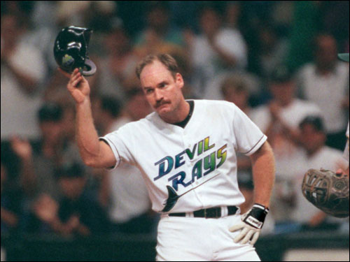
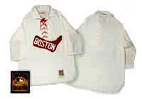
Dishonourable Mentions- Boston Red Sox 1908 Home Uniforms, San Francisco Giants 1977 Road Uniforms, Tampa Bay Devil Rays 1998 Uniforms, Anaheim Angels 2000 Alternate Uniforms
Related:
Top 10 Ugliest NHL Jerseys of All-Time
Top 10 Ugliest Jerseys in NBA History


Pingback: Top 10 Ugliest NHL Jerseys of All-Time « Critically Speaking
Dear Andy, I read your article on the 10 Ugliest Uniforms in Baseball History. I was kind of surprised as well as not surprised. We will start with #10. The Florida Marlins 1993 Teal Jersey. I do recall the Marlins wearing that jersey for batting practice, but never as an alternate home game jersey. I really love that teal color, mainly because it was something different from the other major league team colors. Also, what other color could go right with the Florida coast and a Marlin Fish? Unfortunately, they didn’t keep it longer. Seeing a teal batting helmet other than your usual navy blue, blue, red,etc. was a relief for baseball. #9. The Expos home jersey was really nice when they wore this design. I could understand about the pale blue, it did seem too colorful. But think, would it have looked any better in road gray? Please, I think that I will stick with that pale blue. The only thing that meesed up this jersey was when they went with a pinstripe home jersey. Who are you kidding, the cubs look better in that design. Couldn’t they have thought of any other design besides the cubs pinstipes? #8. Diamondbacks. The only great thing about that design was their alternate purple road jersey. Can’t go wrong with purple! #7. Thank God for owner Charles Finley! Someone finally got creative and broke the normal mode of designing MLB uniforms.I don’t care what you say, the gold and green colors are a good mix, and always stand out.I always loved the A’s colors. Especially when they changed the green to forest green. That forest green can never go wrong with gold. Unfortunately, they took out the gold jersey afetr the 1986 season. What a bummer. But at least they kept the forest green jersey since 1994, Thank God! something other than your usual baseball team colors. As for those 1972-1981 designs, I hope they will come back to Oakland, at least for retro-friday games. #6. I don’t recall the Cleveland Indians wearing these jerseys, mainly because we didn’t see any Cleveland Indians games, since we lived in Chicago. But I do recall them wearing them once while watching a White Sox game on TV. If they wore that jersey with white pants, I would be OK with it, like the Braves and Red Sox do for home games. But red pants? no way
#5. The 1980 Houston Astros Jersey has recently been very popular among the cooperstown collection. If it was up to me. I would like to see the Astros wear this jersey as a retro-Friday option for home games. Anyone care to agree? #4. The White Sox 1976-1981 jersey was interesting. Even though it was your usual navy-blue color, at least it made up for the different combinations it had.The all navy-blue combition was interseting, but sometimes dull, especially when they wore it too many times. Still, I’m glad to see that they did away with that design. #3. The Orioles orange jersey does seem like a good combination with white pants, but your right, never with orange pants. #2. I think that one of the most exciting World Series was the 1979 World Series. For starters, no Yankees or Dodgers.Anyway, I beleive it was the only Colorful World Series ever, with the exception of the 1972 A’s and Reds. The Pirates gold uniforms and the Orioles orange uniform made that World Series unique and different. Great Way to end the Colorful 70’s! Unfortunately, the Pirates stopped using black and gold uniforms in 1985, replaced by what? you guessed it road gray,what a bummer.Last but not least, #1. To say that the Padres design is the uglist uniform got me by surprise.I would say that the 1986 Boston Red Sox road jersey must come down as the uglist uniform in Baseball history! whoever came up with that design, must have thought about it a lot, wouldn’t you agree? Yeah right! You are you kidding! True, the brown color isn’t my favorate color, but I will take a colorful uniform (even brown and gold) over any uniforms that don’t have color at all! At least the Yankees have a touch of white on their road uniforms. Finally, I would like to know which are your Top 10 MLB uniforms. If you can, please e-mail me. Thank You.
Obed:
I’m more of a traditionalist when it comes to baseball jerseys, which is obviously where you and I disagree. I’m not necessarily opposed to coloured uniforms (as an addition to the white and greys), but hate garish colours and would prefer teams stick with grey than go orange, purple, pale blue, or teal. Especially in the case of teal, which I suppose you’re either for or against. For me, it’s too intertwined with the 90s to take seriously, seeing a teal uniform makes me think of the ol’ days of boy bands and expansion teams.
As for the 1986 Boston Red Sox road jersey, I’d say it’s more dull than ugly. It was far too unremarkable to bother remarking on.
I’ve never nailed down what I think are the best uniforms of all-time, but given my preference of the traditional, I’d have to say uniforms like the traditional Yankee pinstrips and Los Angeles Dodgers whites rank highly. I also have a fondness for the current Seattle Mariners home and road jerseys as an example of how to use different modern colours in a traditional way.
The Oakland A’s uniform above was not just a road uni.
The “Swinging A’s” of the 70’s wore the gold tops at home as well. They actually wore green tops … and gold tops … on the home and away. (They also wore white tops at home on Sundays.)
And that jersey was not the first time Finley had the team wearing yellow tops. They actually wore a yellow sleeveless jersey – (with matching yellow pants no less) years before the Championship run of ’72 through ’74.
You know, I knew that about the A’s and their green-coloured uniforms (and even wrote about it in the paragraph description), yet somehow overlooked that when I wrote that the yellows were road jerseys. Thanks for pointing it out; the mistake has been corrected.
Pingback: Top 10 Ugliest Jerseys in NBA History « Critically Speaking
MLB-
I guess I’ll be playing Devil’s Advocate to some extent. I liked the jerseys for the Astros (my team), Indians, Pirates and Orioles (agreed a darker orange would have been better). Your comment about it being a out the whole uniform is where I agree. A giant tomato (Indians) and pumpkin (Orioles) I agree with. A bad color design outside the jersey (Pirates) I also agree with. I wonder what Dave Parker thought when he had to put on that stupid looking hat. The later version of the Astros rainbow uniform I liked better with the plain white pants (c. 1979). Unlike you I really HATE pinstripe uniforms. An additional suggestion to throw hour way are the Braves uniforms from the late 1970s (Horner, Murphy, etc.). Bleeeck!
NHL-
NHL-
Excellent choices. I was absolutely aghast and horrified to see that flaming horse’s head when it came out (Calgary). What the hell was my team thinking? It looks hideous! I liked their old jerseys from the 1980s especially the white field. I don’t care for the more recent ones. A black “C”? No thanks.
By the way start poking around the European leagues if you want to see some REALLY ugly jerseys. In fairness there are some good ones too (HV 71- blue/Sweden & old Spartak Moscow/Russia with the simple “C” above the diamond are two I like).
Yeah, I’ve intentionally kept these lists to North American major pro leagues, cause it gets really bad when you look around the minors or other parts of the world (who have different cultural ideas about fashion). Particularly bad with European sports is how advertisements mess up the jerseys. There’s nothing I hate more on a jersey than clutter.
What was the color combination (shirt and pants)
of the special Sunday only uniforms of the Oakland
A’s back in the early 70s?
Sorry dude, I can’t help you there (as I don’t know). Good luck with your googling.
all white on Sundays….i am thhe uniform zeus……try me!!!!!!!!!
This is in reference to a lot of the Uniforms. I am a very avid collector of Baseball unoforms, as well as studied the history of all the teams and te different styles they have worn over the years. I love seeing the Turn Back The Clock games and seeing the olders styles when they use them. Yeah lets go with the Traditional and boring uniforms that some teams have used for the last 50 to 60 years or even longer. I like seeing teams change design every once in a while. It makes collecting jerseys more exciting for someone like myself who loves to find the odd ball or even unique styles that were used or are being used. I personally get bored seeing the same damn uniforms day after day, year after year and in the case of the Yankees and Dodgers years after years. I think the Sunday alternates should be a league participation. I also think the MLB should have about 2 or 3 Throwback(TBTC) nights/days every season were all 30 teams participate, but still allow each team to have their own TBTC nights/day. Heres an I idea, lets see if we can get the Yankees to try and change for a season or 2 or maybe get an alternate or maybe get the Dodgers into a pinstripe style.
First off the Padres Owner was not a bank owner, the owner was Ray Kroc who was the founder of Mcdonalds, which explains the Gold Uniforms. Second the padres never had purple pinstripes or purple and orange logos. The colors were navy and orange. As for the Camo jerseys, it seems ok now that other teams have started doing the same thing like the Reds & White Sox who also wear camo jerseys on occasions, but when it was just the Padres they were considered ugly. Another personal opinion I don’t know how te Padres had the #1 ugliest uniforms when you look at the White Sox style at #4 which they wore shorts, it should be the #1 ugliest on pricipal alone for it not even being a complte uniform. I mean seriously have you seen pictures from back then. It might have been different had they worn shorts like the do now hanging down to the knees, but these were tight cut, tight fitting shorts back then.
Hmmm… I read the thing about the banks on the internet, so it must be true. And the dark blue always looked purple to me, but I guess I was wrong.
No, he meant C. Arnholt Smith. Smith was the owner of a bunch of banks and was the original owner of the Padres. Then around 1973 he started having financial problems and Ray Kroc, the McDonald’s bazillionaire bought the team from him so that they wouldn’t be moved to Washington D.C. After the Senators became the Rangers by moving to Arlington, nearly every major league team with financial problems talked about relocating to Washington. Oh, by the way I liked those all yellow Padres uniforms from around 1972 and 1973. Don Zimmer who was the Padres manager during that time period wrote in his book that he looked like a fat canary in those yellow Padres uniforms.
Padres never wore purple.
Fixed
Enjoyed reading your 10 worst. One that you missed is the Phillies “Saturday Night Special” I believe it was from 1976 but not sure. It was all maroon (jersey and pants) with white trim. It was so bad they only wore it for one game! Fans hated it and players refused to wear it after the first time.
I thought about the Phillies jersey, but the reasons for its ugliness were the same as the Indians, and since that was worn more, I went with it.
im a marlins fan AND I LOVE ME MY TEAL NIGGA!!!!!
BEST COLOR IN THE WORLD!!!!!!!! WE BLEED TEAL!!
As one of what I’m sure are not many die hard Marlins fans, you have my permission to love teal jerseys. You’ve earned it.
The first owner of the Padres was C. Arnholt Smith who owned a bank that went under. When the Padres signed Steve Garvey he wanted a real baseball uniform so the Padres switched to a brown pin striped home uniform.
Pingback: Critically Speaking 2010 blogging in review « Critically Speaking
Glad to see a fellow Rangers fan on here Mark. Well, actually I’m one of the few who are both a Rangers and an Astros fan. I’m not too crazy about the Rangers uniforms now though. I’d like to see them go back to their original uniforms from 1972. I wonder how some of the old timers from that era like Tom Grieve, Toby Harrah and Jeff Burroughs would feel about that. Tom does the color commentary for the televised games so I’m sure he’d have something to say about it. I liked the old red, white and blue uniforms and the blue caps with the red bill too.
THE ALSO WORE ALL GREEN AND ALL GOLD DOUBLE KNITS IN 1973…………..I NAVE THE CARDS TO PROVE IT……I LOVED ;EM……AS WELL AS THE SLEEVELESS FROM 1963(KC) THRU 1967 AND 1968 THRU 1071 IN OAKLAND. IT BROKE MY HEART WHEN THEY WENT TO THE PERMANENT WHITE PANTS WITH THE GREEN/GOLD/WHITE JERSEYS………..IN 1972. NOT CLOSE TO THE SLEEVELESS UNIFORMS WITH THE BELT. BEST UNIFORM IN SPORTS ……EVER!!!!!!!!!! I SAW THEM IN 68 OR 69 ON THE GAME OF THE WEEK IN THE ALL GOLD SLEEVELESS UNIFORMS……I WAS TRANSFIXED. THE A’S WERE MY FAVORITE TEAM RIGHT THEN AND THERE….THOUGH I LIVED IN DALLAS…………..IT KILLED ME WHEN WE GOT THE RANGERS THE VERY YEAR THE A’S CHANGED TO THE DOUBLE KNITS IN 1972. I NEVER SAW THE COOL UNI’S IN PERSON…….1 YEAR TOO LATE………DAMMIT.LOL………TIMING IS EVERYTHING……. IF YOU HAVE UNIFORM QUERIES. I’M YOUR GUY………GUESS, YOU COULD SAY I’M OBSSESSED SINCE THAT T.V.SATURDAY IN THE LATE 60’S………..MARK BROOKSHIRE
Mark, The A’s have again brought out the Yellow or Gold Alternative jerseys and right now they are getting real popular with the players, fans and managers. I always dug those jerseys too and am glad we are back in them. No Cal AL Oakland A’s fan
dude your so retarded, you put all of the BEST unis of all tiime in this list and the most CLASSIC, YOU SIR ARE A MORON, the marlins teal unis-AWESOME, the dbacks unis AWESOME, the pirates yellow-CLASSIC AND AWESOME, the orioles orange-AGAIN CLASSIC AND AWESOME, the expos uni BEAUTIFUL, the athletics uni SO GOOD, and last but not least the astros rainbow uni, this really pissed me off because i think this uni is without a doubt the absolute BEST uni of all-time, i cannot believe you had the nerve to make this article and put all the most classic and best unis of all-time in here and disrespect them by calling them ugly, you sir should be smacked
My thoughts exactly, Dustin. What a terrible list. Almost all of these are great unis, especially the Expos, Pirates, A’s and Astros. The author should be tarred and feathered.
What about the Chicago White Sox uniforms 1982-1986 which were a mock version of the Houston Astros 1980? They were awfully tackyas well.
Yeah, that was probably an oversight.
Regarding the Indians uniforms at #6, Boog Powell, Tribe’s 6-4, 230 lb first baseman that year, said he looked like a giant blood clot in the red uniforms.
Nice.
I think we all agree you are an idiot, while some of those jerseys may be terrible, most of them were perfectly fine. Given the year for some of those that’s how most jersey’s looked. Also I loved that original Marlins jersey, their mascot is a MARLIN of course it should be teal it’s a fish you moron. What doesn’t make since are the new colors for the Marlins. Orange, yellow, blue, black and I think red, it’s like a retarded rainbow and doesn’t represent a marlin at ALL. Also that Indians jersey is good considering it was 1976. The Orioles 1976 jersey has nothing wrong with it either in my opinion, do you know what an oriole looks like? it’s BLACK and ORANGE! I wonder if you took into consideration what any other their mascots were before you wrote this retard post because your comparison of the Orioles orange jersey to Halloween is serious autistic. I hope you feel stupid because you officially wasted the time of everyone who read this.
I actually feel great for officially wasting the time of everyone who read this.
Gotta stand up for the brown-and-gold 70’s Padres unis (as opposed to the 80’s duds, which incorporated orange into the mix). The dominant brown color was very appropriate given the brown robe on the (very cool) Padres’ Swingin’ Friar logo. The official color of the Franciscan Order is brown. “Franciscan friars first came to the west coast in 1769, with the arrival of Franciscan Friar Blessed Junipero Serra in California. Franciscans from Mexico and Spain continued Serra’s work, establishing a total of 21 missions from San Diego to the San Francisco Bay region.” Plus I actually like the gold-and-brown color scheme. But whether one likes the colors or not, at least they were unique. Today the Padres uniforms look EXACTLY LIKE THE DODGERS (and an innumerable number of other pro sports teams) who have adopted blue as their dominant color. Why in the world would the Padres forsake their history and adopt the color scheme of its most hated rival? What next: the Red Sox in pinstripes?
Good way of describing, and nice paragraph to take facts about my presentation focus,
which i am going to present in university.
Great article on describing the ten ugliest uniforms in MLB history. Unfortunately, the Indianapolis Arrows would never have made this list, since their uniforms would have actually been pretty decent, with blue and white jerseys (originally to have been accented by red, but was to have been replaced with black).
I know this is an old post, but, as an old guy, I want to enlighten anyone who stumbles across this about those gold/brown Padres unis. The Padres were owned by a man named Ray Croc. If that name isn’t familiar to you, well he created a little hamburger empire named McDonalds. So naturally he put his baseball team in the same colors as his hamburger slinging employees. Lovely no?!
They’re so ugly, they’re beautiful!
For the most part, baseball uniforms are all pretty similar and business-like with the buttons down the front. For most of major league history, … jjerseysb.wordpress.com
For the most part, baseball uniforms are all pretty similar and … jbaseballb.wordpress.com
Pingback: 1977 Topps baseball cards - Master of Geen
Sorry I have to disagree, each and every uniform you picked has something in common, they are different and unique. It’s getting to a point where every team is starting to look like another, and uniforms are startng mudane.
In addition with the third/ alternate jerseys fueling the popularity of the merchandise industry. The color gray for the base color on away uniforms, is also starting act like a skipping record. You are entitled to your own opinion as well as I, MLB teams will always design a uniform one time or another that someone or some people will dislike.
I fully agree. The dude basically doesn’t like colorful uniforms. Baseball uniforms for far too long are boring to look at, like concrete.
And looks like we are pretty much in agreement. Here’s my take on it (with the best thrown in just for fun):
https://totallyrandomgarbage.blogspot.com/2019/04/bestworst-mlb-uniforms-nl.html
I, too, hate pinstripe uniforms. In fact, I found this page by searching for that phrase.